T-Mobile Dining Rewards
Goal: Reimagine T-Mobile Dining Rewards as part of the T-Life ecosystem. Give users a way to explore restaurant deals in their area and earn cashback while supporting local businesses.
Overview:
T-Mobile strives to live up to its reputation as the “Uncarrier” by providing the user with a variety of benefits and cashback deals. One program available to customers is T-Mobile Dining Rewards, where those with a qualifying plan can link their credit or debit card to receive automatic cash back at dining partners in their area.
Prior to this workflow, Dining Rewards was a standalone website run by a third party program. Few customers were taking advantage of the program, or even knew it was available to them. They would have to visit the site to create an account, link their card, and browse the selection of websites. It was a very clunky experience. By bringing Dining Rewards into the T-Life app we hoped to bring awareness to the benefit, but also make it much easier for a customer to enjoy it.
Final Design:
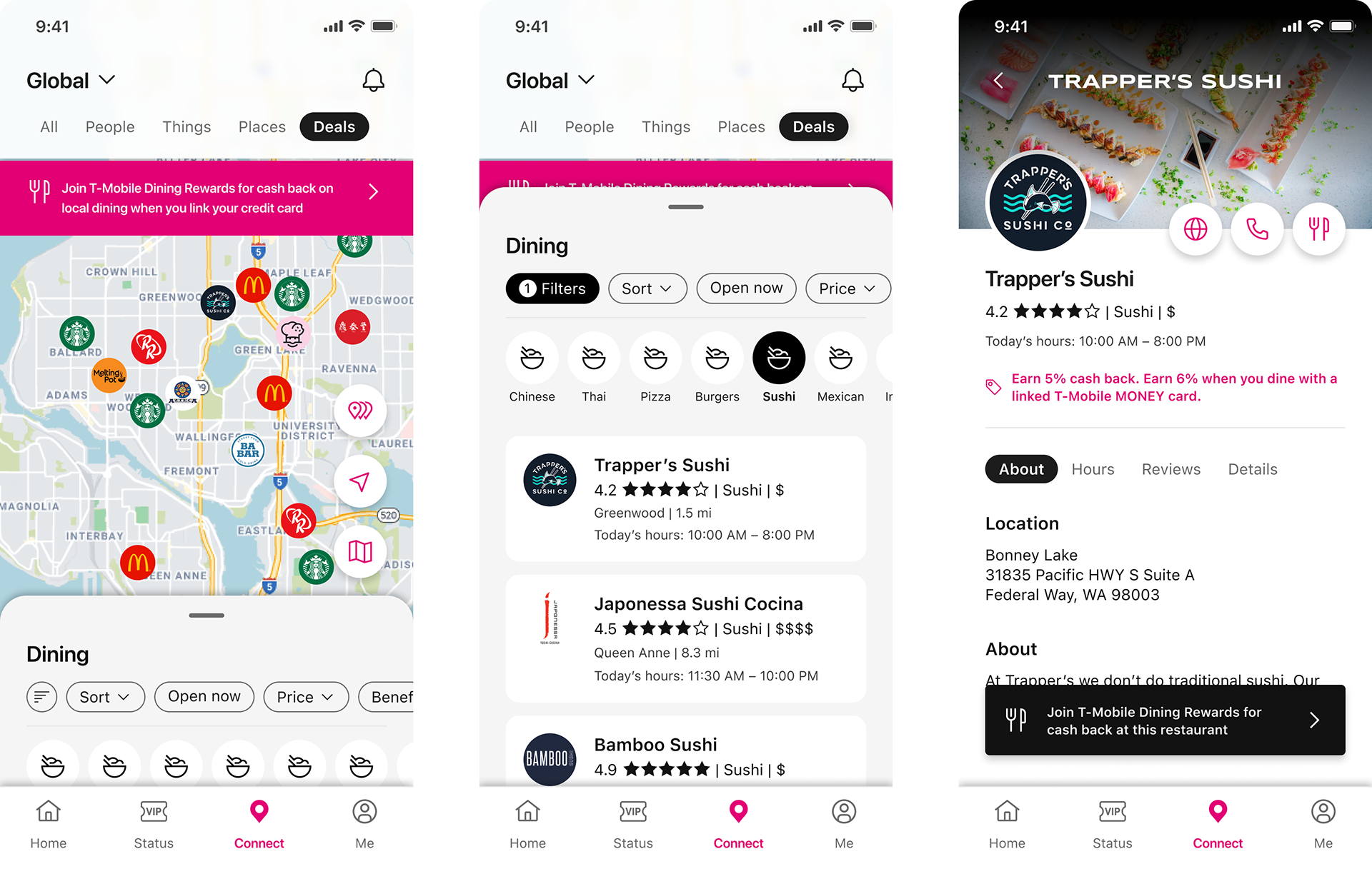
Below you can see key screens from the T-Life app. You can also explore the full flow here.
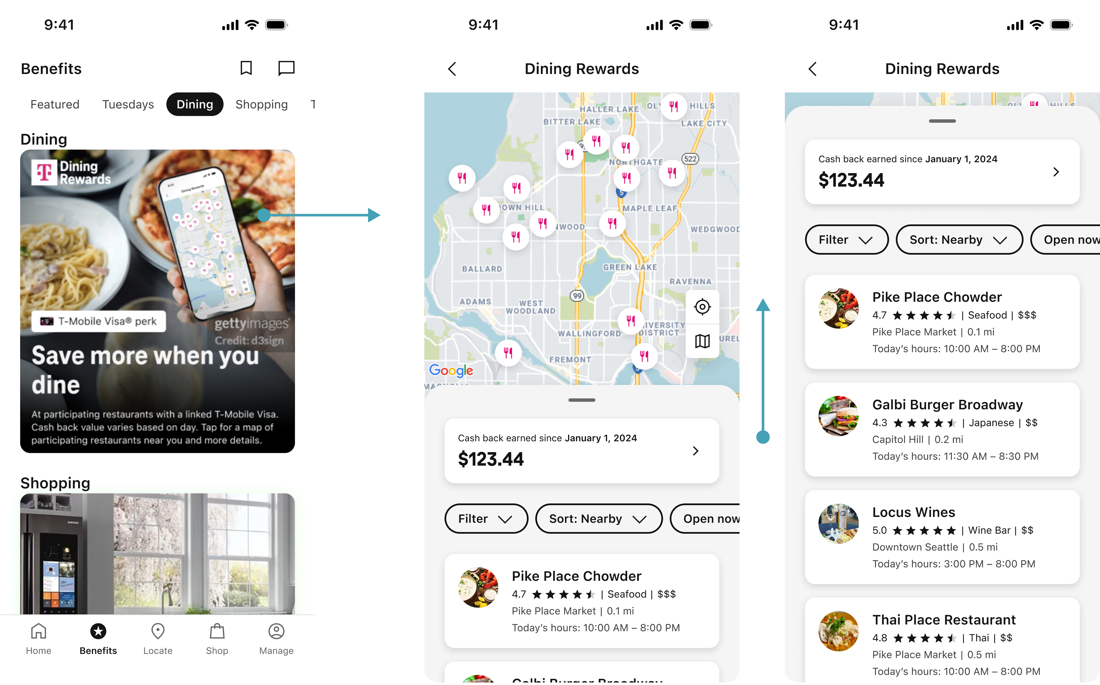
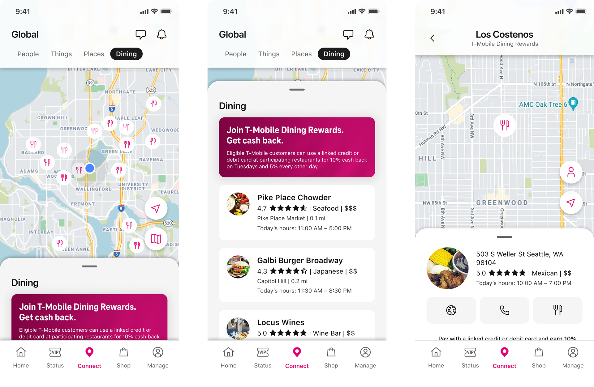
The user can access T-Mobile Dining Rewards through the Benefits tab of the T-Life app. When they land in the Dining Rewards experience they will see local restaurant parters where they can earn cash back rewards each time they dine. They can choose to explore the map, or refine their results via the sort/filter options.
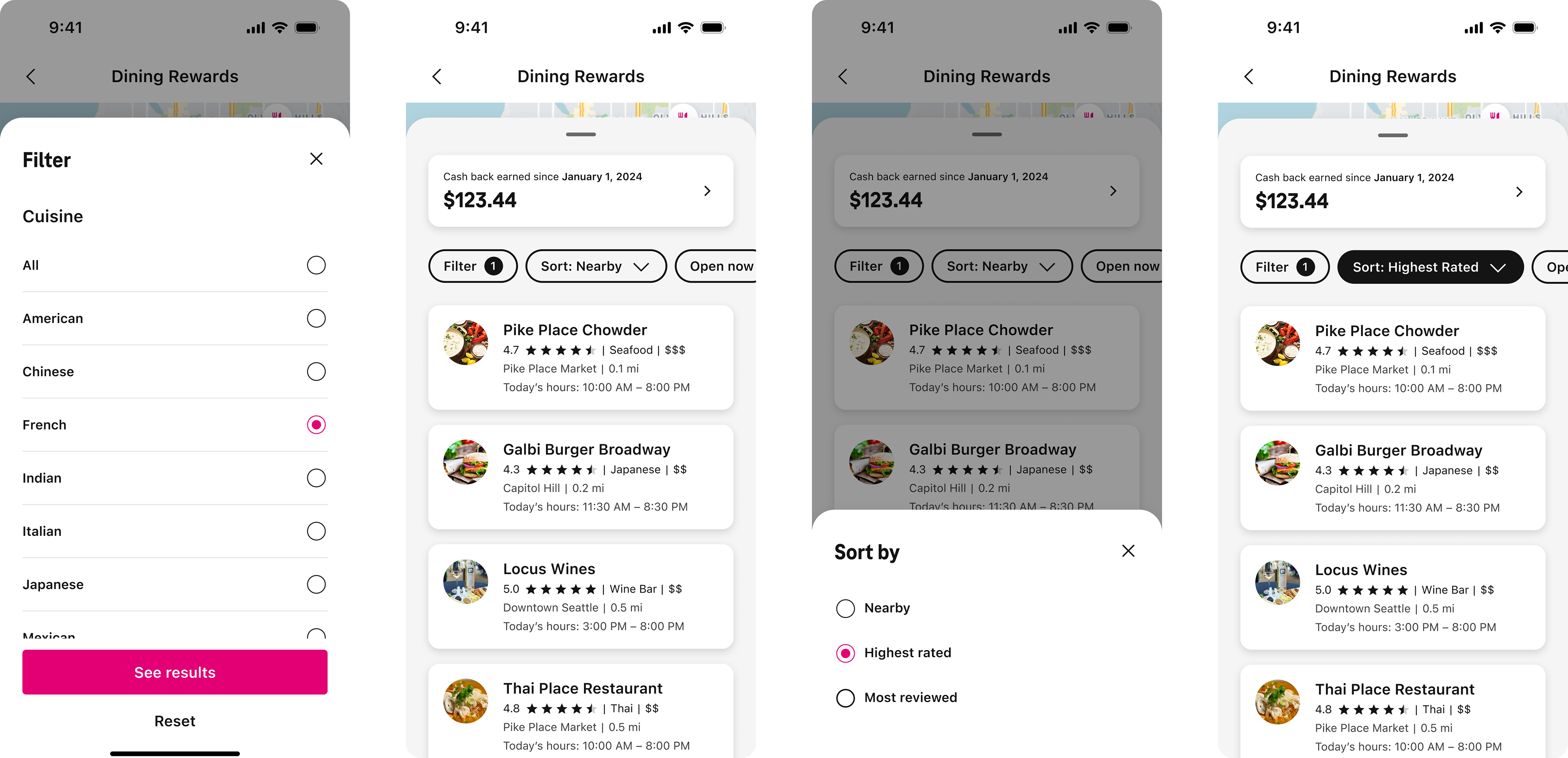
The filter options are available in a long, scrolling list. Initial concepts utilized more variation in the UI to create visual hierarchy. However, in the end we had to align to the more minimalistic approach used by the finance/commerce features of our app. If I was given free reign to explore these concepts further I would have done user testing to determine best practices while possibly including more of the visual interest originally proposed.
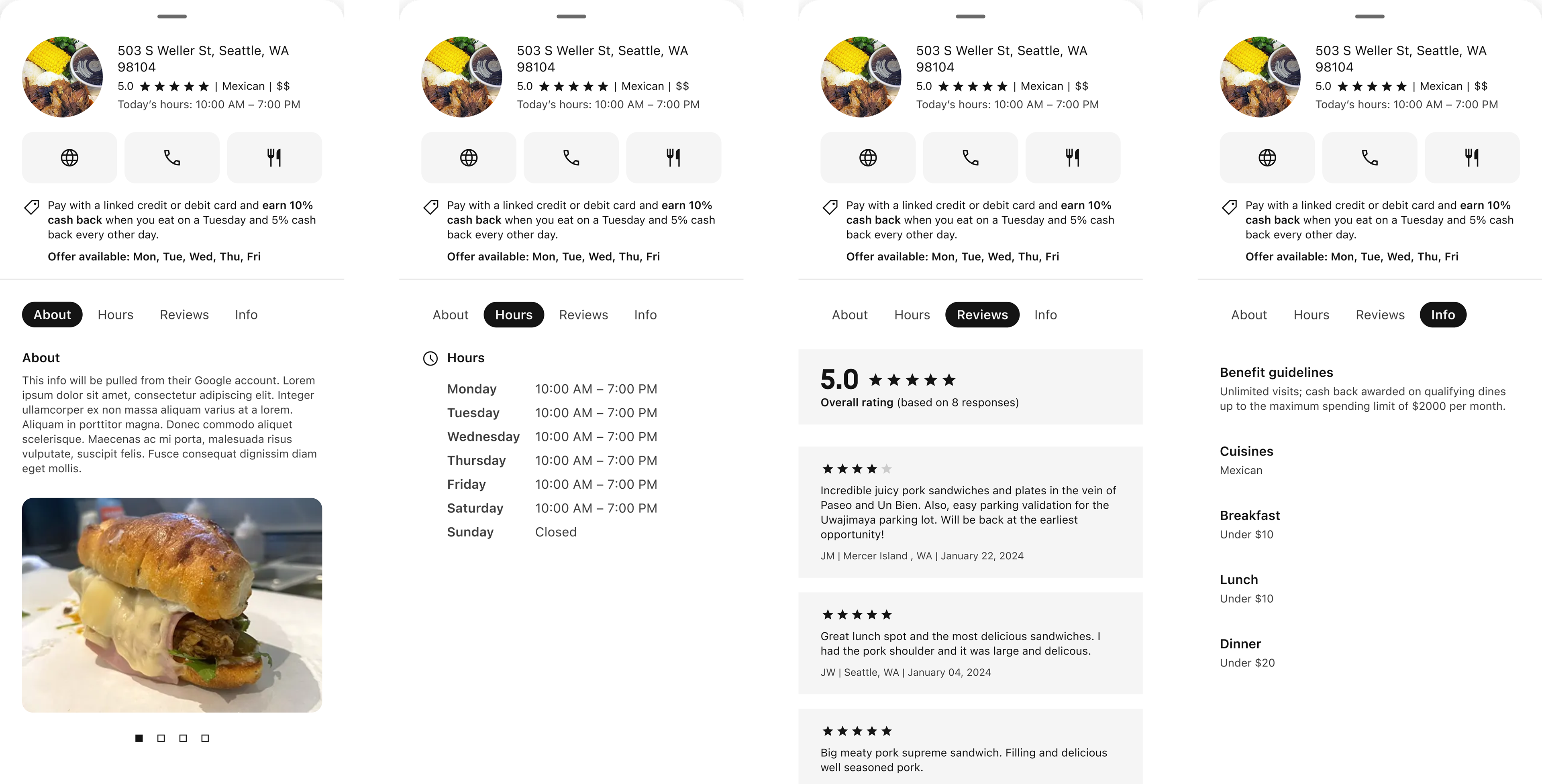
The drawer for restaurant profiles was aligned to an existing Store Finder feature, where users could get info about local T-Mobile locations before visiting
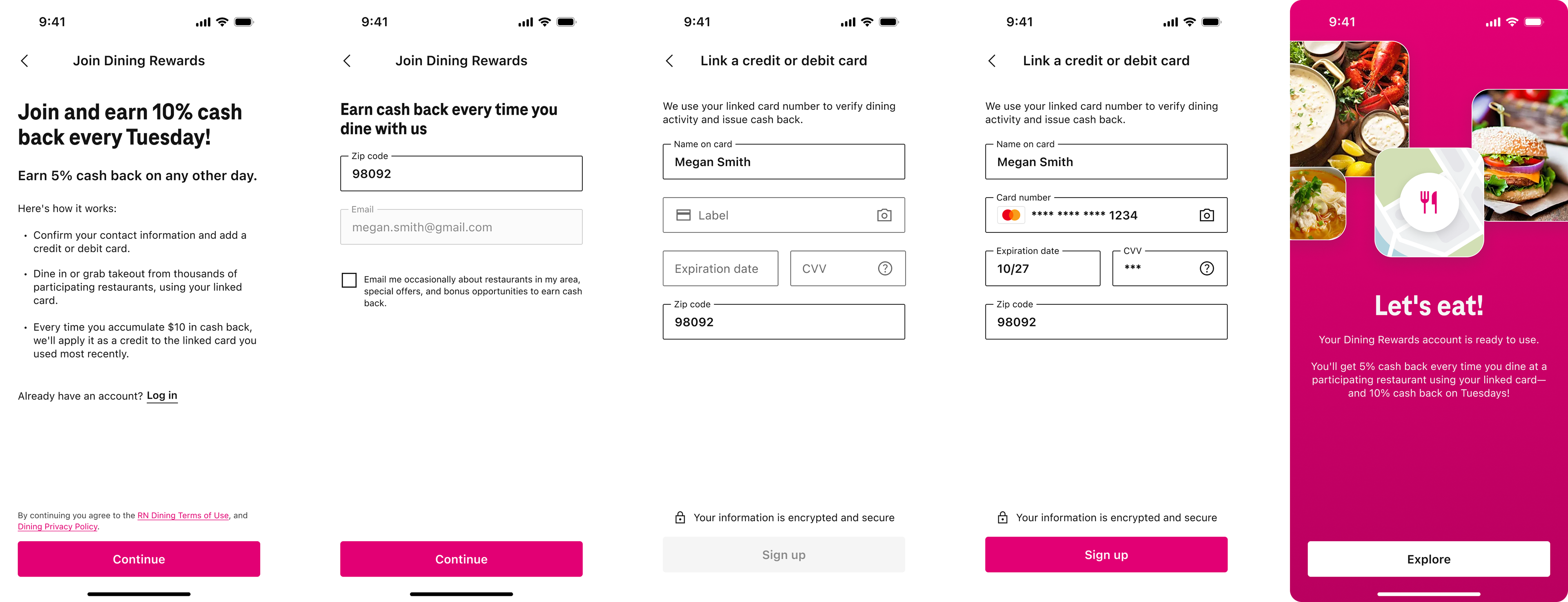
The improved sign-up experience, which replaced the previous web-wrapped form. This iteration requires the user to manually enter their card info to link it to the account, but the goal was to allow them to choose from existing cards in their T-Life wallet in a future release.
Considerations:
1. The experience should include the ability to browse restaurants from a map or from a list
2. Users should be able to look at a restaurant profile in order to learn more and read reviews
3. Once registered with a linked card, the user would not need to take any action in the app. Cash back is rewarded automatically after the transaction is processed with the linked card
4. Due to development limitations the initial release would exclude features like filtering, as well as creating or managing an account. These have since been added as part of a fast follow
5. The design should follow precedents set in other areas of the T-Life app, like Store Finder
Process:
The first step in the design process was taking time to really look at other apps with similar experiences. I explored a variety of flows, from Google Maps to Yelp, and Uber Eats. Combining this research with conversations with my peers, I was able to get an idea of what worked well in each of these apps so I could include best practices in my design.
From here I began mapping out our “happy path” via wireframes. As I talked through the experience with product and dev, it became clear that we would have to limit our initial scope, meaning we wouldn’t be able to include some of the aspects I felt were important to give the user a positive experience. Instead of allowing the user to sort and filter the restaurants, they would have to scroll the list in order of proximity. I felt strongly that this would result in users abandoning the experience, and pushed to prioritize this work as soon as possible.
Likewise, the initial dev limitations meant that the sign-up experience would need to be web-wrapped, bringing the user to the existing third-party site. This was tedious and not well formatted, resulting in user dropoff. Since our goal was to increase engagement with the program, I felt it was important to improve the sign-up by making it part of the native flow and simplify the steps as much as possible.
I've included examples from different stages throughout the design process below:
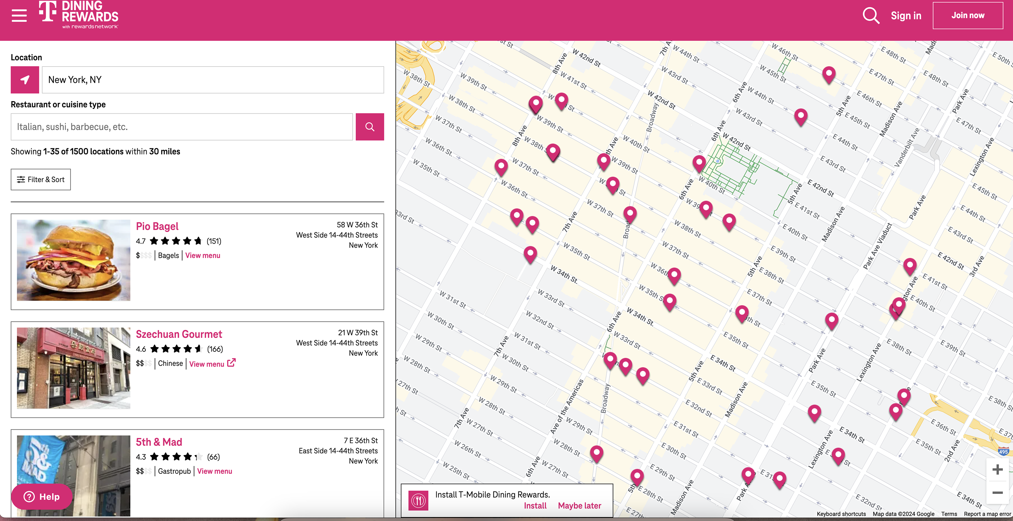
The third-party website we were tasked with bringing into our T-Life ecosystem
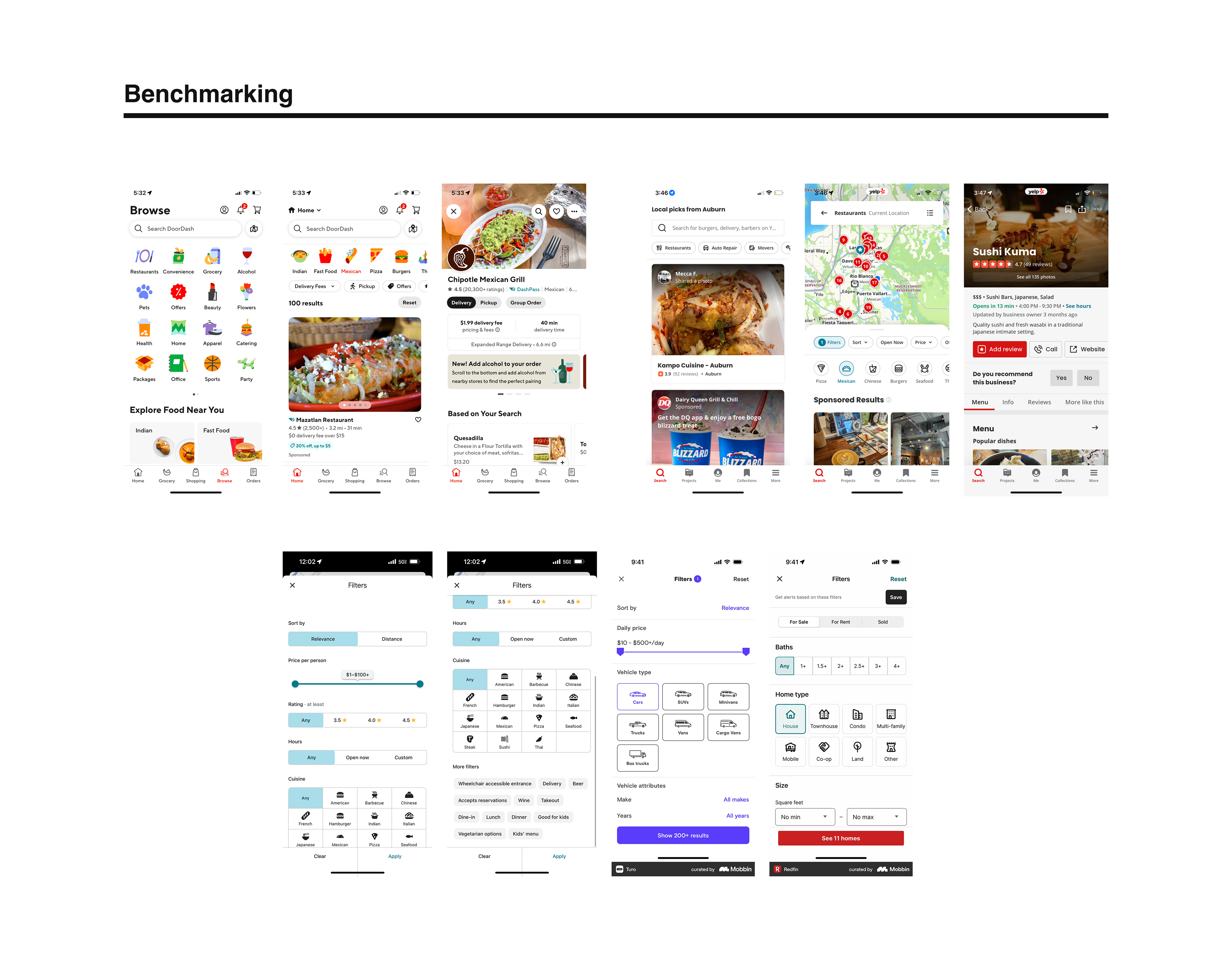
Just a few examples of the many apps I tested for best practices
One of the very first concepts, including my first iteration of filters. These were descoped for our initial design and pushed to a later release. Other changes included the sign-up banner looked too much like an error notice, and the restaurant profile needed to be simplified to align to T-Mobile Store profiles, which already existed in the app.
Phase one of T-Mobile Dining Rewards, shipped in the T-Life app. While sort/filter had to be descoped for our original release, I pushed for it to be a priority in our following releases.
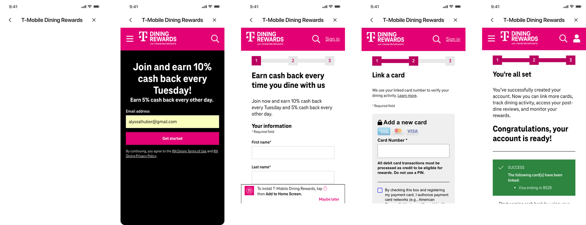
Due to dev constraints, the feature was originally shipped with a web-wrapped sign-up experience. This was cumbersome for users and resulted in a high rate of abandoned forms, so this was reworked to be a native form in a recent release.